
Should I be having a heart attack?
I saw this photochop design on a Habs fan blog, adverstising it as the new Habs Reebok jersey design.
I wanted to retch!
I'm fairly certain - please correct me if I'm wrong - but didn't the Canadiens organization state that the Habs duds would remain unchanged except for the material?
I imagine that the Habs rendered jersey above would likely cause rioting all down St. Catherine street.
I'd prefer a riot be brought on by a Stanley Cup win, personally.
I'm somewhat reassured that the Original Six jerseys won't be drastically altered, after peeks at the Rangers, Bruins, and Red Wings maintaining classic looks. Not sure that Reebok would risk a collective hurl from the hockey hotbeds over these gambles in fashion statement.

I can handle the Senators looking like fairies. No problem there. Deface the Canucks jerseys all they want - 37 years later, fans in Vancouver still can't agree on one particular look. Fudge up the Sabres duds again - who cares?
Just don't bugger with the greatest jersey in all of sports!
Heck, I might even land on common ground with a Leafer on this one. Can you say sacriledge?
I'll be frank, downright, and straight to the point: All these new Reebok NHL streamlined jerseys are butt ugly!
Every single new design looks like a skirt. With thinning vertical lines and armpit shading colors, the entire hockey jersey look has gone to hell.
Why in the world does anyone at the NHL level feel the league needs these puke inducing, girly looking makeovers? They're a joke!

Vintage Flyers, R.I.P.
These tight fitting atrocities fit to the form of the players, making them look more muscular. I don't believe that it is worth sacrificing the games sacred emblems, designs and logo's for these vertical streamed disasters. Hockey jerseys are the most treasured jersey in sport. This is not some baseball shirt or flabby basketball muscleshirt the NHL is tampering with, it is the most unique and beautiful paraphernalia in all of sport.
Doesn't anyone get that tradition is important to hockey fans. Buffalo's new Sabreslug pyjama tops don't look any better when Buffalo's winning. They still look out of place. Numbers on the front, for Christsakes! Hockey fans, the game's die hards that are the sports foundation, will be reviled.
The design includes stretchable panels under the arms and will move most jersey designs into a more vertical format. Yuck!

The "tough" looking fairy Senators look.
The Reebok claim of improvement is that the jerseys will make the players faster. Right! They suggest that because these pyjama's are water resistant, players will weight less during the course of a game. Of course we all know that if a player is 1.7% lighter, he'll simply fly now, right?
It can't provide a competitive edge - all players will be wearing them - except they'll look like shit!
Brett Hull spoke out on them over the initial unveiling at last year's All - Star game."I think the new sweaters are completely ugly, and I don’t think they should be allowed," he said of the advent of the new jerseys, suggesting it was "One of the reason I quit!"
I can picture the business of throwback and vintage jerseys booming soon after the introduction of these elastic tragedies. Hopefully they go the way of the dreaded Cooperalls, those all-in-one pants combo's worn by the Flyers and Whalers in the early 1980's. Hopefully, they follow the glow puck into the land of forgettable disasters.

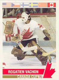
The legendary Canadian book, "The Hockey Sweater", by Roch Carrier, has won literary prizes and cultural awards for capturing the iconic stature that is a hockey sweater.
These new duds are duds! They will never inspire any such devotion.
With the Reebok look, the hockey jersey look is dead.
It seems that the league prefers to cater to the fleeting fan, who thinks angled stripes and vertical bars are just cool.
My prediction is that fans in hockey strongholds will fill arena's with boos. Or continue to fill them less and less. It ought to be an unqualified disaster that won't last more than a season.
Fans should boo them when they see them hanging from the racks in sporting goods stores. When the clerk tells you they are water resistant - piss on them!
I'm getting royally riled that equipement manufactures have gone overboard on the notion they can affect and improve the game. They've sold players on skates and sticks, but are now using this scheme to schmooze the common consumer into ixnaying the game's classic look and slip into these silk socks with arms.

Year in and year out, for some time now, various manufacturers of different pieces of hockey equipement swear up and down that their product will improve the game of hockey and impact players on ice performances.
Now we have this Reebok claim that lighter jerseys, with tighter fitting fabrics, will now make a player skate faster.
Maybe they should have invented skates that makes a player so fast, the jerseys blow dry.
What next, somebody inventing a more accurate puck?
Why do we continue to swallow these overblown pretensions?
Anybody knowing how testing works, surely knows that test results are about as random and dependable as a slanted survey.
My biggest gripe has always been with the one-piece, snap at random, graphite sticks that players en masse have converted to in the last decade. While players love their lightness, their isn't a single statistic that proves to me that the majority of players are shooting pucks any harder with them.
Take last season's All-Star game skills competitions for a random testing ground. Since the rise in popularity of these graphite sticks who can actually attest to having increased power? Zdeno Chara won the hardest shot competition with his reinforced one-piece, netting him a speed of 100.4 mph. Ten years ago, Al McInnis registered the exact same result with a wooden stick.
So, where's the progress? They shatter more cleanly?
Skate technologies have vastly improved the hockey boot, making them firmer and better fitting. While the more comfortable boots translate into better skating because of feel, it can hardly be claimed that it makes a skater any faster. A new blade technology, such as the CT Edge Design, claims to improve speed with a smoother glide and less dig.
I always thought the harder you dig, the better the push. The stronger the push off, the stronger the glide. Something's amiss here.
Muscles, training and practice, tend to have more profound effects on a player. Testing is a rather dubious and iffy science as it doesn't consider the role that physical improvement plays into results.
With all the supposed advances, isn't it odd to note that in the speed skating competitions at the last decade of All-Star games skills contests, that only three players have had better times than Andy McDonald's 14.03 this past year - yet it is often assumed that today's skaters are much better than years ago. Perhaps Reebok can spin that the players were just wetter years ago.
Skate sharps are a peculiar taste among players, with every player having a prefered technique on demand to team trainers. Many will do it themselves they are so finicky. Give them new blades with slighter flares and they will be filing them whatever way they choose just as they always have.
Does the less dig technology apply to all weights of players, or only the lighter ones?
Will the "no sweat-less-wind-resistant" jersey also make the slow players 8% faster?
There are so many variables in any type of testing, that making large claims can seem dubious, almost misleadingly dishonest.
I never buy into a sales pitch based on on claims. I trust time tested results.
Now where did I put that patent for the velvet cushioned jockstrap? It says here that players wearing them tend to block 53% more shots and have better looking offspring! Women will love them for different reasons!
But don't trust me!


23 comments:
"faggot looking makeovers"
Charming. If one listens closely, they can hear the faint swish of your credibility as a writer circling the bowl...
I'm tired of all these anonymous comments, if you think it's not worth your time, then why bother even posting a comment?
You've lost whatever credibility and respect you had as a writer. Once I was a loyal reader of your articles and touter of your blog, but I am no longer. How can I ignore the fact that you are a narrow minded biggot?
wow, harsh words man, it's just an article, you can have your own opinion, doesn't mean you need to completely blow Robert off.
Yes they were harsh words, but it was certainly deserved. By hurling such unnecessary epithets into his article, Robert is giving credence to the argument that bloggers lack certain qualities of journalistic integrity, specifically the absence of any accountability. Robert can continue express such defamatory views, and in the end what can anyone do about it since it is just a blog?... Simple answer; we can choose not to read it.
I completely agree with Anon.
That kind of language destroys your credibility and made me shake my head that anyone should take amateur coverage seriously.
If you don't like something, learn to criticize it intelligently. You don't need to resort to words that are used in bigotry & hatred against people. I'm sorry if you think it's a harsh indictment but it's pretty hard to consider you very respectfully at this point.
Childish at best!
I suggest you issue a retraction and/or delete this phrase. Good editing is worth as much as good writing. Maybe you can get a mulligan here; I don't know the tolerance of your user base. But for the love of peace and the sake of other bloggers, please kept it civil.
I have my own Habs blog (which I run Sept-whenever) and I hope we can keep things on a higher level.
Otherwise you've done a good job - just keep it clean.
I don't see why a slip of the keyboard by Robert would smear all bloggers anymore than any racist/sexist article by one journalist would end up marking all other journalists as the same.
It's his platform for his ideas and if you don't like them then don't read them.
As for the jerseys, if they mess up the Leafs and Habs jerseys I'll boycott Reebok merchandise.
I look this blog daily..
And even I am disapointed with that remark.. I won't stop reading it, BUT it has to be mentioned and noted, there is no room for that , especially here. I always saw this as an intelligent.Blog.
Continue the great work.
Eric
About the "faggot looking makeovers"
I respect people who speak their mind a lot more then hypocrites who think it, but try to stay politically correct.
I agree with the author, it's a girlie looking makeover.
This is brutal, you can't stand anything new? how many times has the Habs logo been altered in the course of its time? How many times has the jersey changed looks? from sweaters to lace collars to water resistant. Who cares, nothing is wrong with change, and its the narrow minded fans or the old timer fans that always have something against it. Major changes to the colors and the jersey have happend in its 100 year history, it wasn't the end of the world then, its not the end of the world now.
I happen to think the new Capitals jersey is 100 times nicer than the old, the new sharks logo is 10 times better than the old, and good for them for wanting change, spice it up abit.
Its time to come out of your shell pal, an extra stripe or an added color somewhere isn't going to change anything, and if you think its all gay and girly and its practically ruining hockey for you, then close up shop, get rid of this blog, and go watch curling.
Things change, teams change, styles change, the same idiots who still wear 80's style clothes in the new millenum are the same narrow minded people like yourself and everyone else who shares your ridiculous little opinion about change, Grow up folks.
"I respect people who speak their mind a lot more then hypocrites who think it, but try to stay politically correct."
So, it's better to be a loud bigot than a quiet bigot? Nice. That's like saying you respect someone who punches you in face more than someone who just WANTS to punch you in the face, because the first person follows through on his convictions.
Why can't one just hate the look of the jersey and say so without using slurs?
Obviously you don't have much respect for or awareness of your readership. Very disappointing!
Wow, did I get called some things for this one!
My sincerest opologies to those offended by my wording. Allow me to explain my (bad) choice of words in the context of my apprehension for these jerseys that repulsed me. Allow me also to defend that I am neither narrow minded, nor a bigot.
Consider that to many Habs fans, the Canadiens jersey is practically saintly. They don't say hockey's a religion in Montreal for nothing! So one can understand the point that I was damn mad just looking at them.
The word I chose to use, that has certain readers upset, will be replaced soon as this apology/retraction is posted.
I earned the adjectives hurled at me - it was insensitive of me to include that type of adjective in my post.
Call it a "rough draft slip" if you will - it was not intended to make it's way into the final copy. I wrote the article over several days before posting it this morning after having worked a 12 hour shift. In my haste....a proof read brain cramp and I missed it.
I am substituting the "girly" word, suggested by one commenter above.
I am not a bigot when it comes to sexual preferences and orientations. I have several friends and aquaintances who are gay and quite happy being who they are. I say good for them. Living amongst and around them never has, and never will be a problem for me. There is probably a better manner to say what needs to be said. I'm not all that ggod at this. There's enought hatred in the world already.
I do not consider myself narrow minded. Some things in life benefit from constant change, others don't. I've always believed in both credo's that anything can be improved, while if something is working, it needs no fixing.
I will be leaving the comments section unedited until sunrise tomorrow, after which it will be trimmed down. Meanwhile discussion is still open on the jersey's looks.
One recent comment has suggested "Why can't one just hate the look of the jersey and say so without using slurs?" It is the way I shall proceed in the future, while keeping such thoughts in mind.
Thank you all for posting. My apologies once again. I'm hopeful that you can continue to get what you have gotten from my blog.
Robert L
I agree with your being upset about the horrendous choices being made on the new jerseys for the NHL. However, you should count to ten before beginning to tap the keyboard. Then, read over your work with a thought for who will be reading it. Since Mr. Stubbs has posted links and mentioned your site on HIO, you must begin to think like an editor.
One other thing, Robert L, I liked the skating section. Perhaps an interview with a power skating expert or a speed skater could discuss the merits of different skates with an eye to the exaggerated claims they make.
G-Man
PS- I will keep reading, just have a care for the sensitive issues and "hot" words.
Robert, being from the old school and being a Habs fan for over 50 years I have to agree with your thoughts on the style change. I do like the older looking design and feel the newer one takes abit away from what I grew up with. But as a few posters have commented on that change is like time and sooner or later its bound to happen and like it or not we will have to follow in line screaming or not.
Robert L
That sounds like a sincere apology and I hope everybody will forgive, and eventually, forget. You've built a good thing here and put a lot of hard work and thought into your work, and have earned yourself some fans. It's a lot easier to lose them. It's actually a good thing that people voiced their displeasure because most people don't comment at all. A simple word like that can carry a lot of hate and I think it was important for you to clarify that you don't endorse that, it was a mistake. Some people commented before that you sometimes got a little defensive. I no longer see any evidence of that, so I'm sure this mistake won't be repeated either. Keep up the otherwise exemplary work, and we're looking forward to that goalie mask page.
Andrew (kilroy)
Dear Commenters of August 24, 2007 - this is for you.
I learned something today - many things in fact - that should serve me well to not forget or ever take for granted again. My earlier apology would have included what I will say below had I not been required to head into work yesterday evening.
Above all else that has been discussed herein today, I am blessed to have a very astute bunch of regular readers of this blog. How I got here - I don't know. I'm fortunate I guess.
I respect all your feeling greatly, and I am flattered that you all think so much of this blog, to comment and criticize constructively as you have done today. I do not take my readers lightly.
It is difficult from my perspective to separate various "Anonymous" posters from each other in today's comments. I imagine each person has their own reasons for remaining anonymous, and I can respect that. The comments of today were incredibly direct and packed enough wallop that they really did not need a name attached to add impact.
Several messages, which I've addressed in a previous comment, came through loud and clear!
My biggest lesson of today revolved around the use of a word that is often used to hurt.
It is a word I have employed in the past, not to demean a segment of society, but having grown up hearing it in my youth, I usually use it to describe compromising ideals of which I cannot comprehend in regards to change.
It's difficult to explain what I liken the term to, but it's definitely not people!
The word has re-entered my vocabulary via a pre teen daughter who has uttered it uncorrected as of late. That too, shall change.
Earlier today, before I went in for the night shift, I had her glance at the jerseys, read parts of the blogs and comments, and did a little teaching, of sorts.
She agreed that the jerseys were suckish, but as a hockey player herself, was not altogether thrilled that I was now terming it "Girly". Can't win 'em all!
I was surprised, even caught off guard at the notion that my site and I had gained enough credibility for it to even come under question. Your comments today served as advice, reminders, and wake up calls. I felt readers disappointment and then I felt my own shame at having made them feel as such.
Many of my posts on EOTP are adrenaline derived, stream of conscience rushes. As I write, I'll often insert words I know do not fit my intent. As ideas tend to flow quickly, I usually hit the "shift 8" key for an asterix and revisit the word later.
I missed one this time, but my error was in employing it the first place.
Earlier, in my previous comment, I mentioned that I would delete the comment section for today after 24 hours. I have changed my mind on that. I will be leaving it up longer to allow more thoughts on it - mostly to ensure I don't forget it myself. and also to allow me to respond to all of those who cared enough to passionately take the time to add their words.
I'd like to address each and every comment directed here today, but I fear misinterpretation in rushing it, to be quite honest. I appreciate that fellow bloggers pinched in to defend freedom of speech notions - which are important when not slagging off a demographic. If the intent had been truthful, my expalnations would be different.
The intent was not willingly there, hense, backing it up cannot be truthful - thanks though!
When time allows, I may get around to addressing each comment here, as is my usual practice. Accountability tells me I should extend that branch.
It's a busy family weekend, but I'll give it my best come late Sunday night.
Until then, peace to all and feel free to continue commenting.
Thanks for feeling the need to comment. I cannot emphasize how much it is appreciated.
Later,
Robert L
My only question is, why the hell does every NHL team see fit to change the colour scheme of their jerseys? I mean, if the Bruins can go with solid panels on solid panels, and keep their horizontal striping, why the hell can't everyone else? I mean, new jersey designs are certainly one thing, but just look at that Predators jersey. Never mind the fact that the colours were always shit. What's with all the damned piping? Does that look like a hockey sweater to you?
But I wouldn't worry too much about the Habs. They haven't changed the visual design of their jersey since 1913, and only performed minor tweaks on the logo in the last 80 years, I'm not seeing it happening now.
I think you are putting way too much stuff into one subject.
The new Jerseys are streamlined and it could improve the game in some way. If at the end of the game Kovalev isn't freezing his ass for 22 minutes in a cold sweaty shirt before going on the ice (cause Carbo benched him for a defensive mistake) he could be more ready to play.
Then again, it's Kovy.
The change in design for Vancouver has nothing to do with Rebook. It has everything to do with the Canucks trying to find an uglier jersey than they "V shirt" a couple of decades ago.
Newer sticks aren't more powerful? Why? Cause Chara can't get a higher number than MacInnis did ten years ago? I think it's a testament to how good those sticks are. Chara is no Macinnis.
Now, to say that iw will improve the game SIGNIFICANTLY... there is a huge step.
Talk to you later dude
I don't mind change, but I hate change for the sake of change. Bettman changed the NHL logo - for the sake of change. He altered the divisional and conference names - for the sake of change, although some may argue it was to increase U.S. exposure.
Now it's on to jerseys. I would be all for changing the Habs jersey, if and only iff, it was an improvement. Judging by the "sneak peak" however, it is not. To me, it is like changing the flag of a nation - the jersey is the team's flag and due deference should be paid to it.
Sam L.
p.s. Good job Robert L. You took the criticism honestly and learned something. That doesn't always happen, and as much as you deserved being dissed from your choice of words, you also deserve props with the way you subsequently handled it. You still have credibility in my books.
Brown Jesus - Thanks for the fair words!
I did earn my shitkicking.
My take is that I somehow stumbled upon credibility, and I plan to treat it like a newborn.
I'm thankful that readers have been forgiving. Like I said before, I find myself fortunate to have a very bright readership.
So far the Senators'Uniform' is by far the worst of these disgusting reebok uniforms!!
I have to admit they do look like faries. I will be rooting against them big time if I can even stand to watch. To the people that complain that some of us don't like change, and that there has always been change, you are a bit off the mark.The sweaters of the 20's look cool as hell.The jerseys from the 30's.40's and 50's look cool.the dureen jerseys from the late 60's took a step back fabric wise(at least the designs were ok)...on and on..By the early 90's absolutley every team had an awesome design! the point is up till now all the NHL Jerseys looked relitivley great. Sure there was change, but now we come to a point where the change is horrendous!! These things look like robot uniforms.I appreciate the Bruins,Rangers,Wings and Canucks for making the best out of a losing (NHL Mandate)situation., but the cut on these things will make even the most traditional teams look bad.I am still wondering whether I will be able to watch the NHL this upcoming season.The whole look of the league depresses the hell out of me. I hope it backfires and the NHL goes further in to the tank!(for now)..or until Bettman is fired.
Post a Comment