

I'll be frank, downright, and straight to the point: These new NHL streamlined jersey are butt ugly!
Why in the world does anyone at the NHL level feel they are even needed. They're a joke!
These tight fitting atrocities fit to the form of the players, making them look more muscular. I don't believe that it is worth sacrificing the games sacred emblems and logo's for these vertical streamed disasters. Hockey jerseys are the most treasured jersey in sport. This is not some baseball shirt or flabby basketball muscleshirt the NHL is tampering with, it is the most unique and beautiful paraphernalia in all of sport.
Doesn't anyone get that tradition is important to hockey fans. Buffalo's new Sabreslug pyjama's don't look any better when Buffalo's winning. They still look out of place. Hockey fans, the game's die hards that are the sports foundation, will be reviled.
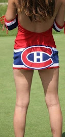
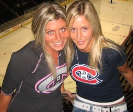
Form fitting hockey wear should go no farther than this puckbunny top, pictured below. Okay, so it's painted on, but you get the point.

It seems that the league prefers to cater to the fleeting fan, who thinks angled stripes and vertical bars are just cool.
My prediction is that fans in hockey strongholds will fill arena's with boos. Or continue to fill them less and less. It will be an unqualified disaster that won't last more than a season.

Brett Hull spoke out on them over the weekend.
"I think the sweaters are completely ugly, and I don’t think they should be allowed," he said of the advent of the new jerseys, suggesting it was "One of the reason I quit!"
Apparently the new duds are not as radical as the original concept showed. Reebok, the designer, worked with NHL players to smooth out the rough spots.

I can picture the business of throwback and vintage jerseys booming soon after the introduction of these elastic tragedies. Hopefully they the way of the dreaded Cooper all-in-one pants combo's.
The legendary Canadian book, "The Hockey Sweater", by Roch Carrier, has won literary prizes and cultural awards for capturing the iconic stature that is a hockey sweater.
These new duds are duds! It will never inspire any such devotion.

The jerseys get their first exposure at the All-Star game in Dallas next week. The players will be wearing the new Reebok designs that the NHL will adapt league-wide next season. It is designed for a tighter fit with lighter fabrics. The design includes stretchable panels under the arms and will move most jersey designs into a more vertical format. Yuck!
Some other news is coming from this mess. Apparently, teams will go back to wearing white, and only white, at home next season. I liked it when they switched a few years back. Original six teams should be allowed to maintain the tradition of the dark home jerseys that have forever outsold the whites. This could then mean that teams will stop wearing third jerseys altogether, though it's unknown if vintage sweaters will still be allowed since, after all, they resemble and form of tradition that our game once had.
UPDATE: From a tip at Mirtle's site, comes this piece from Arizona Central News. Sounds just a little better. Players remain pro and con.
UPDATE 2: Kukla's Korner is still hot on this story. On the chance that you weren't linked to this piece by KK , check it out, it's getting pretty in-dept. As of this time, 19 comments of all perspectives are filling the post and Paul has been adding links as they come in. So far, he has added a USA Today article, and a Star piece. In the comments box there is also an artists rendering of what some jersey's may look like.


4 comments:
Crap they are pretty ugly.
I wouldn't mind the painted on jerseys for the team players though. I don't tink many would protest... much.
Except for the poor players. They'd have to put up with all those "Smaller Number" taunts!
I'm still going to wait to pass judgement until I see the actual product during a game and on television.
But I can say this - early review is it is not nearly as bad as I thought it was going to be.
I was at Team Canada's Summer 2005 Olympic training camp when they unveiled form fitting uniforms for the final red/white scrimmage. The reaction was a quick and decisive groan from the crowd. They were so tighter about 10 of the biggest guys couldn't fit into one.
Clearly the people behind this jersey revolution have refined it some.
Joe Pelletier
http://www.legendsofhockey.blogspot.com
rI heard about that reaction and understand that alot of time,money and effort has gone into it. My take is that the form fitting design is a concession to fashion that is not needed and that vertical stripes should be exclusive to officials. Those various Sabres and Mighty Ducks jerseys that employed vertical and diagonal designs just never looked proper on a hockey jersey.
From the various reports it sounds as thought the original six designs will remain unchanged. With that news, I will live.
Post a Comment